After applying the material design to its mobile operating system, Google is now bringing a new material design to Chrome.
On Friday, The Next Web discovered a Google Code discussion which appears to suggest that the first Material Design alterations to Chrome will begin appearing in Chrome OS with the launch of version 50.
By enabling certain ‘flags’ in the Settings menu, The Next Web was able to see a few of the changes early. Although the changes aren’t going to turn the world upside-down, they’re a good indication of the direction Google is moving in 2016.
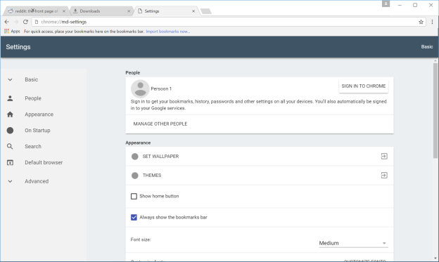
For example, the new tabs have sharp edges rather than rounded ones, the menu button on the right side of the address bar has been converted from three lines into three dots, and many of the other buttons have been visually refreshed as well.
The Google Code thread also includes a preview image of an incognito mode with a darker theme, which might make it easier for a user to tell if they’re browsing in an incognito tab or a standard tab.
Other changes include a better scrolling bar, brand new icons and redesigned pages for Downloads, Extensions, Settings and History. The new Settings page is especially pleasant to look at:
There doesn’t appear to be a set release date for any of these features or visual upgrades, but considering the fact that many of them are already available to PC and Chrome OS users (providing they’re willing to do a little digging), it seems likely that some of the updates will begin to appear in the next versions of Chrome released to the public.
Stay tuned for more Google Tips & News!

Don’t forget to Subscribe (On the right)


